Commons:Featured picture candidates/File:Warm front.svg
Jump to navigation
Jump to search

File:Warm front.svg, not featured
[edit]
Voting period is over. Please don't add any new votes.Voting period ends on 9 Jan 2015 at 20:46:40 (UTC)
Visit the nomination page to add or modify image notes.

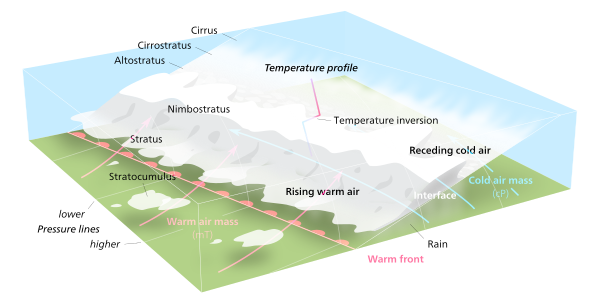
 Info Illustration of a warm front. all by Kelvinsong—Love, Kelvinsong talk 20:46, 31 December 2014 (UTC)
 Support—Love, Kelvinsong talk 20:46, 31 December 2014 (UTC)
- Support Nikhil (talk) 03:45, 1 January 2015 (UTC)
 Comment I think it is a very good illustration, but it took me a long time to understand the temperature step function graph you have tried to place in 3D. Since there is no axis indicating the direction in which the temperature increases, I feel it is ambiguous. I have two proposals: Either remove it, as I think it is clear from the graphics already that there is a temperature step in the interface, or place the temperature graph on the side cut with a directional axis indicating the direction in which the temperature increases. -- Slaunger (talk) 14:11, 1 January 2015 (UTC)
- I based the picture off this image which has the same temperature graph thing. The important thing that it shows isn’t how the warm air is hotter than the cold air but that it goes opposite the usual trend where it gets colder the higher up you go. You also can’t put it outside a corner of the graph bc it has to cut through a region where there’s both hot and cold air, and I’d rather not put it on the side bc then you’d have to shear it oblique to fit the perspective which would be confusing too—Love, Kelvinsong talk 15:42, 1 January 2015 (UTC)
- OK, I see where it is coming from, but I do not think it works in the source either (for me at least it is also ambiguous). -- Slaunger (talk) 09:26, 2 January 2015 (UTC)
- Kelvinsong, Slaunger are correct, suggestion: use a colour differentiation in the profile, on the bottom edge the temperature is high (use full red) rising the temperature down (use red to blue degrade) on inversion layer the temperature is high (reverse to red using degrade), and in the top edge direction the temperature down (reverse to full blue using degrade), I believe this helps the interpretation in a profile without reference axes, the temperature profile is relevant I think you should stay. The infographic is very good, congratulations. -- Lauro Sirgadocontribs 17:28, 2 January 2015 (UTC)
- Okay I did as you said—Love, Kelvinsong talk 19:54, 2 January 2015 (UTC)
- Almost. I believe you are using transparent layers, the profile should "overlap almost", in the case of temperature profile in the ground has to be very strong red and much more blue at the top, there must be consistent contrast between the colors in all altitudes: The inversion layer is clear and correct other areas would improve with higher contrast. Sorry my insistence but otherwise not notice real difference in understanding the profile and thanks again for the effort, I hope it helps -- Lauro Sirgadocontribs 22:22, 2 January 2015 (UTC)
- I think that’s because the bottom branch goes purple to blue but the top branch goes red to purple which is harder to see than the blue–red contrast at the inversion thing. The gradient goes straight horizontally it’s not like along the path or anything—Love, Kelvinsong talk 15:02, 3 January 2015 (UTC)
- Kelvinsong, Ok, try it. Remember it is only a suggestion, just to help. I changed the gradient to adjust the colors vertically. I'm bad at it are not well balanced in the extremities, but may help. -- Lauro Sirgadocontribs 16:52, 3 January 2015 (UTC)
- I think that’s because the bottom branch goes purple to blue but the top branch goes red to purple which is harder to see than the blue–red contrast at the inversion thing. The gradient goes straight horizontally it’s not like along the path or anything—Love, Kelvinsong talk 15:02, 3 January 2015 (UTC)
- Almost. I believe you are using transparent layers, the profile should "overlap almost", in the case of temperature profile in the ground has to be very strong red and much more blue at the top, there must be consistent contrast between the colors in all altitudes: The inversion layer is clear and correct other areas would improve with higher contrast. Sorry my insistence but otherwise not notice real difference in understanding the profile and thanks again for the effort, I hope it helps -- Lauro Sirgadocontribs 22:22, 2 January 2015 (UTC)
- Okay I did as you said—Love, Kelvinsong talk 19:54, 2 January 2015 (UTC)
- Kelvinsong, Slaunger are correct, suggestion: use a colour differentiation in the profile, on the bottom edge the temperature is high (use full red) rising the temperature down (use red to blue degrade) on inversion layer the temperature is high (reverse to red using degrade), and in the top edge direction the temperature down (reverse to full blue using degrade), I believe this helps the interpretation in a profile without reference axes, the temperature profile is relevant I think you should stay. The infographic is very good, congratulations. -- Lauro Sirgadocontribs 17:28, 2 January 2015 (UTC)
- OK, I see where it is coming from, but I do not think it works in the source either (for me at least it is also ambiguous). -- Slaunger (talk) 09:26, 2 January 2015 (UTC)
- I based the picture off this image which has the same temperature graph thing. The important thing that it shows isn’t how the warm air is hotter than the cold air but that it goes opposite the usual trend where it gets colder the higher up you go. You also can’t put it outside a corner of the graph bc it has to cut through a region where there’s both hot and cold air, and I’d rather not put it on the side bc then you’d have to shear it oblique to fit the perspective which would be confusing too—Love, Kelvinsong talk 15:42, 1 January 2015 (UTC)
 Question Just a quick technical question regarding the SVG: Is the inlaid text embedded in a manner in the SVG, which allows easy localization to other languages than English? -- Slaunger (talk) 14:13, 1 January 2015 (UTC)
- yep! It’s in a hidden layer in the SVG. The displayed text is an outline render of the actual text bc the wikipedia renderer sucks at text—Love, Kelvinsong talk 15:43, 1 January 2015 (UTC)
- Excellent, and yeah, I know the renderer sucks. -- Slaunger (talk) 09:26, 2 January 2015 (UTC)
- yep! It’s in a hidden layer in the SVG. The displayed text is an outline render of the actual text bc the wikipedia renderer sucks at text—Love, Kelvinsong talk 15:43, 1 January 2015 (UTC)
- Support Great graph. We need more of those, especially in that quality. --Frank Schulenburg (talk) 06:15, 2 January 2015 (UTC)
 Conditional neutral
- Support New temp graph works for me. Nice suggestion Lauro Sirgado
 . -- Slaunger (talk) 20:02, 2 January 2015 (UTC)
- Support per Frank --Martin Falbisoner (talk) 18:32, 2 January 2015 (UTC)
- Support per Slaunger : ))) -- Lauro Sirgadocontribs 22:22, 2 January 2015 (UTC)
Confirmed results:
Result: 6 support, 0 oppose, 0 neutral → not featured. /-- ChristianFerrer 17:11, 10 January 2015 (UTC)