Commons:Featured picture candidates/File:Josefine Hökerberg 2013-11-21 001.jpg
Jump to navigation
Jump to search
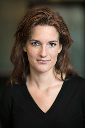

File:Josefine Hökerberg 2013-11-21 001.jpg, not featured
[edit]
Voting period is over. Please don't add any new votes.Voting period ends on 6 Jan 2015 at 21:28:50 (UTC)
Visit the nomination page to add or modify image notes.

 Info created by Magnus Bergström, uploaded by Kaiketsu, nominated by -- Yann (talk) 21:28, 28 December 2014 (UTC)
 Support A professional portrait of a Swedish journalist. -- Yann (talk) 21:28, 28 December 2014 (UTC)
 Oppose DOF is too small. Only the eyebrows and hairline are in focus. –Makele-90 (talk) 01:34, 29 December 2014 (UTC)
- Oppose nice, but false focus point: it must be to the eyes not to the eyebrows. Very pity. --Alchemist-hp (talk) 01:40, 29 December 2014 (UTC)
- Oppose as well. A very striking portrait, but Makele and Alchemist are right about the DoF issue. Daniel Case (talk) 05:17, 29 December 2014 (UTC)
 Comment The DOF is short on purpose. This is from a professional photographer. You guys don't know what you are talking about. Sigh. Yann (talk) 10:35, 29 December 2014 (UTC)
- Comment When I see a portrait of someone I generally expect that it will show all the relevant parts of them in focus. So the photographer was a professional ... well, does that mean he or she doesn't have to meet our standards? It may be clever and artsy, but it isn't what we're looking for. Daniel Case (talk) 17:30, 29 December 2014 (UTC)
- That's a poor understanding of photographic technic. Shorter DoF are used to emphasize a part of a picture, and it is done here with great mastery, as Colin explained below. Regards, Yann (talk) 17:45, 29 December 2014 (UTC)
- That's a poor excuse. The short DoF that f/1.8 gives you is great for a insect on a flower, which you would need for emphasis. But here there's no need to make us look at her face at the expense of her hair. A nice choice for a book cover perhaps, but not a portrait. Do any of our other featured portraits of people do this? Daniel Case (talk) 04:04, 31 December 2014 (UTC)
- @Daniel Case: No. For macro photography, the exact opposite is usually done: closingg the aperture to maximize the DoF. Regards, Yann (talk) 19:51, 1 January 2015 (UTC)
- @Yann: I seem to recall some of the macros approved here with a shallow DoF. But if we want to talk portraits there is no denying that f/1.8 is pretty shallow compared to the linked portraits above: According to their EXIF data, the Robert De Niro image is at f/3.5, Merkel at f/4 and Carla Bruni at f/5.6. So I don't think they support the argument that this is standard for great portraiture, no. Daniel Case (talk) 05:23, 2 January 2015 (UTC)
- @Daniel Case: In a macro, the DoF is short not due to the aperture, but to the distance between the camera and the subject. And in all the cases cited here, f/3.5 to f/5.6 are still wide aperture creating short DoF. You confuse the result with the intent. Regards, Yann (talk) 09:49, 2 January 2015 (UTC)
- @Yann: They're still narrower than 1.8. Daniel Case (talk) 18:31, 2 January 2015 (UTC)
- @Daniel Case: In a macro, the DoF is short not due to the aperture, but to the distance between the camera and the subject. And in all the cases cited here, f/3.5 to f/5.6 are still wide aperture creating short DoF. You confuse the result with the intent. Regards, Yann (talk) 09:49, 2 January 2015 (UTC)
- @Yann: I seem to recall some of the macros approved here with a shallow DoF. But if we want to talk portraits there is no denying that f/1.8 is pretty shallow compared to the linked portraits above: According to their EXIF data, the Robert De Niro image is at f/3.5, Merkel at f/4 and Carla Bruni at f/5.6. So I don't think they support the argument that this is standard for great portraiture, no. Daniel Case (talk) 05:23, 2 January 2015 (UTC)
- @Daniel Case: No. For macro photography, the exact opposite is usually done: closingg the aperture to maximize the DoF. Regards, Yann (talk) 19:51, 1 January 2015 (UTC)
- I know this kind of portraits and it looks just fine from a distance, but if most of the face are out of focus including important parts such as the lips and eyes then I can not support. –Makele-90 (talk) 18:45, 29 December 2014 (UTC)
- The focus "issue" is quite exaggerated. The eyes are "in focus", just not quite as sharp as the rest. Perhaps some comparison with other featured portraits is helpful.
- Not sure who I'm addressing here as there was no signature to the comment, but I think the commonly understood definition of 'in focus' is (even if we don't understand the technicals behind it) the region in which the circle of confusion is the limiting factor. In other words, the area in which the ability to discern the any sharper focus is limited by either our eye's inability to discern more detail, or by the camera's lens and sensor's inability to capture more detail. Therefore, although there is in theory always a single point that is by definition the 'focal point', in practice there is a range that we consider in focus. This varies from person to person and from camera to camera, but when limited by the camera, it is calculable. By this definition, the eyes in this image are definitely not 'in focus' because we can discern that they are less sharp than the sharpest part of the image. Diliff (talk) 18:26, 1 January 2015 (UTC)
- It was my comment, made at the same time as the bullets below. An interesting definition of "in focus" but another would be satisfactorily sharp, and I've given examples below where the subject's eyes were less sharp than this yet no complaint. I do actually wonder if the photographer could have applied some selective sharpening to the eyes, as is commonly done, and we might never have had this discussion. -- Colin (talk) 19:45, 1 January 2015 (UTC)
- Not sure who I'm addressing here as there was no signature to the comment, but I think the commonly understood definition of 'in focus' is (even if we don't understand the technicals behind it) the region in which the circle of confusion is the limiting factor. In other words, the area in which the ability to discern the any sharper focus is limited by either our eye's inability to discern more detail, or by the camera's lens and sensor's inability to capture more detail. Therefore, although there is in theory always a single point that is by definition the 'focal point', in practice there is a range that we consider in focus. This varies from person to person and from camera to camera, but when limited by the camera, it is calculable. By this definition, the eyes in this image are definitely not 'in focus' because we can discern that they are less sharp than the sharpest part of the image. Diliff (talk) 18:26, 1 January 2015 (UTC)
- The focus "issue" is quite exaggerated. The eyes are "in focus", just not quite as sharp as the rest. Perhaps some comparison with other featured portraits is helpful.
- That's a poor excuse. The short DoF that f/1.8 gives you is great for a insect on a flower, which you would need for emphasis. But here there's no need to make us look at her face at the expense of her hair. A nice choice for a book cover perhaps, but not a portrait. Do any of our other featured portraits of people do this? Daniel Case (talk) 04:04, 31 December 2014 (UTC)
- That's a poor understanding of photographic technic. Shorter DoF are used to emphasize a part of a picture, and it is done here with great mastery, as Colin explained below. Regards, Yann (talk) 17:45, 29 December 2014 (UTC)
- File:Robert De Niro KVIFF portrait.jpg is front-focused to the degree that his eyes are soft and no eyelashes visible.
- File:Carla Bruni-Sarkozy (3).jpg is focused well enough, but the picture has less overall sharpness and the eyes are not better than the nomination here.
- File:Angela Merkel IMG 4162 edit.jpg is also slightly front-focused and her eye no sharper than here.
- File:Young Ashaninka girl in an Apiwtxa village, Acre state, Brazil.jpg dares to use f/1.4 (these pros do keep making a "beginner mistake"s!) and has clearly front-focused on the nose. Nobody seemed to notice.
- File:Peter-Gabriel-2011I2.jpg front focused on his beard and has soft eyes.
- This sort of small focus issue happens all the time and is hardly the barrier to FP status some are making here. And Daniel, "there's no need to make us look at her face at the expense of her hair. A nice choice for a book cover perhaps, but not a portrait." is just fundamentally wrong. There's every reason, in portrait photography, to make us look at her face and very little reason for the hair to be in focus. And this isn't Wikipedia -- we are allowed more styles of image-making than technically excellent passport photographs. -- Colin (talk) 10:50, 31 December 2014 (UTC)
- @Colin: First, in all of those portraits you cited save the Brazilin girl, the focus issue is only apparent when you view the image at full size (and as for her, I would have opposed that one, too, had I voted). Second, disagree with me if you want, Lord knows it's happened before, but don't suggest my reasons for disagreement are "fundamentally wrong". Not while I'm not using your arguments to cast implicit aspersions on your sense of aesthetics. Third, yes, I'm aware the scope for Commons is wider than it is for Wikipedia ... but even so I still think this image is not within it enough to be featured. Fourth, "There's every reason, in portrait photography, to make us look at her face and very little reason for the hair to be in focus," ... I ask you if you'd be willing to say that to her face or her stylist's, for that matter. It looks like a fair amount of work went into that hair, and it wouldn't have been that hard for a picture to have been taken at a narrower aperture setting, even given the lighting or lack thereof, showing it in all its glory. Daniel Case (talk) 18:30, 31 December 2014 (UTC)
- You say "there's no need to make us look at her face at the expense of her hair" as though that is some truism about portraiture. Sure, some portraits will show hair in detailed focus. Some might even crop out most of the hair. It's just a fundamentally wrong reason to oppose a portrait, and not supported by any serious study of portraiture. -- Colin (talk) 18:39, 31 December 2014 (UTC)
- "It's just a fundamentally wrong reason to oppose a portrait, and not supported by any serious study of portraiture." Cite please? You might as well just admit it's a matter of taste, and leave it at that. In this case I don't think the hair blurred like it was some protected witness works. It's visible at thumbnail, unlike the other ones. I might not have minded if the hair was largely unlit and shadowed. But it isn't. If this were a general practice of effective portraiture, then a lot of our other featured portraits would look this way. Daniel Case (talk) 06:09, 1 January 2015 (UTC)
- I agree with you Daniel - it simply comes down to opinion and taste. Yes, shallow DOF photography is a legitimate type of portraiture, just like B&W is a legitimate type of photography, but it doesn't mean that everyone does and should appreciate it, nor does it make them ignorant for not appreciating it as an artistic choice. We don't have to be knowledgeable about art or photography to appreciate it. It might help to inform our critiques but it is by no means a requirement for appreciation. If we don't appreciate the way the shallow DOF was used here, no amount of argument is likely to change anyone's mind. Diliff (talk) 18:08, 1 January 2015 (UTC)
- The issue is not about opinion and taste but of expressing one's negative opinion in such a manner that it goes beyond "I don't like the use of shallow DoF here" or "I prefer it for flowers, not portraits". Instead Daniel and others have said the photographer has actually made some fundamental error of portraiture. I find this rude and disrespectful. I was asked to provide examples of other FP that has this narrow DoF, and even found one with the same front-focus issue. But really, our repository of FP portraiture is very small and random and not representative of the gamut of modern professional portraiture. Let's call it a day. -- Colin (talk) 19:45, 1 January 2015 (UTC)
- Noted, and agreed. I think the debate was somewhat confused by two parallel arguments. One, that the focus was missed and should have been on the eyes, and two, that the DOF was too shallow. The arguments are related but not the same. For what it's worth, I definitely wouldn't go so far as to insist on the entire head being in focus. That is not always possible even with a studio set up and f/11 onwards, except with small focal lengths (which suffer from other issues). Diliff (talk) 20:55, 1 January 2015 (UTC)
- The issue is not about opinion and taste but of expressing one's negative opinion in such a manner that it goes beyond "I don't like the use of shallow DoF here" or "I prefer it for flowers, not portraits". Instead Daniel and others have said the photographer has actually made some fundamental error of portraiture. I find this rude and disrespectful. I was asked to provide examples of other FP that has this narrow DoF, and even found one with the same front-focus issue. But really, our repository of FP portraiture is very small and random and not representative of the gamut of modern professional portraiture. Let's call it a day. -- Colin (talk) 19:45, 1 January 2015 (UTC)
- I agree with you Daniel - it simply comes down to opinion and taste. Yes, shallow DOF photography is a legitimate type of portraiture, just like B&W is a legitimate type of photography, but it doesn't mean that everyone does and should appreciate it, nor does it make them ignorant for not appreciating it as an artistic choice. We don't have to be knowledgeable about art or photography to appreciate it. It might help to inform our critiques but it is by no means a requirement for appreciation. If we don't appreciate the way the shallow DOF was used here, no amount of argument is likely to change anyone's mind. Diliff (talk) 18:08, 1 January 2015 (UTC)
- "It's just a fundamentally wrong reason to oppose a portrait, and not supported by any serious study of portraiture." Cite please? You might as well just admit it's a matter of taste, and leave it at that. In this case I don't think the hair blurred like it was some protected witness works. It's visible at thumbnail, unlike the other ones. I might not have minded if the hair was largely unlit and shadowed. But it isn't. If this were a general practice of effective portraiture, then a lot of our other featured portraits would look this way. Daniel Case (talk) 06:09, 1 January 2015 (UTC)
- You say "there's no need to make us look at her face at the expense of her hair" as though that is some truism about portraiture. Sure, some portraits will show hair in detailed focus. Some might even crop out most of the hair. It's just a fundamentally wrong reason to oppose a portrait, and not supported by any serious study of portraiture. -- Colin (talk) 18:39, 31 December 2014 (UTC)
- @Colin: First, in all of those portraits you cited save the Brazilin girl, the focus issue is only apparent when you view the image at full size (and as for her, I would have opposed that one, too, had I voted). Second, disagree with me if you want, Lord knows it's happened before, but don't suggest my reasons for disagreement are "fundamentally wrong". Not while I'm not using your arguments to cast implicit aspersions on your sense of aesthetics. Third, yes, I'm aware the scope for Commons is wider than it is for Wikipedia ... but even so I still think this image is not within it enough to be featured. Fourth, "There's every reason, in portrait photography, to make us look at her face and very little reason for the hair to be in focus," ... I ask you if you'd be willing to say that to her face or her stylist's, for that matter. It looks like a fair amount of work went into that hair, and it wouldn't have been that hard for a picture to have been taken at a narrower aperture setting, even given the lighting or lack thereof, showing it in all its glory. Daniel Case (talk) 18:30, 31 December 2014 (UTC)
.jpg)
- Support The DoF is indeed extremely narrow and if one pixel-peeps then one can see the sharpest focus is literally a couple of mm in front of the eyes. But the eyes remain sharp enough I can see she is wearing contacts, and the details in her iris and blood vessels. Viewed properly, as a whole image from a reasonable distance like one might a real person, it is a striking photo where her eyes absolutely grab you and there's no other distracting details. I join with Yann in despairing about the quality of our reviews sometimes. -- Colin (talk) 13:21, 29 December 2014 (UTC)
- Comment I nevertheless insist her hair is visually interesting enough, and inextricably linked with her face as part of her appearance, that leaving it out of focus is cheating the viewer. Daniel Case (talk) 04:07, 31 December 2014 (UTC)
- Comment I am confused. I wanted to give minus, its looks like hair isnt part of her head, than i read its made by professional. After that i read DoF must be such. --Mile (talk) 15:01, 29 December 2014 (UTC)
- Support per others -- ChristianFerrer 15:09, 29 December 2014 (UTC)
- Support I see no problem with the dof --Wladyslaw (talk) 15:45, 29 December 2014 (UTC)
- Oppose Agree with Alchemist. It would be a great portrait (this DoF is perfect) but focus should be on the eyes. In this cases, reframing a bit after focusing can lead to this kind of problem. --Kadellar (talk) 16:44, 29 December 2014 (UTC)
- Weak Support I agree with Alchemist, but IMO this is a good addition for our people category. ■ MMXX talk 17:22, 29 December 2014 (UTC)
- Support smile is beatiful, no problem with DoF. 😄 ArionEstar 😜 (talk) 18:14, 29 December 2014 (UTC)
- Oppose Yann, Colin, you may add me in your collection of stupid reviewers. I agree with opposers, let me free of that.--Jebulon (talk) 22:45, 29 December 2014 (UTC)
- Oppose While i certainly agree that the portrait does not need to be fully in focus in order to warrant FP status, this professional photographer has made the elemental error of portrait photography; they have not focused for the eyes, or as was mentioned above, have lost that focus while re-framing. Quite a shame.Fotoriety (talk) 23:52, 29 December 2014 (UTC)
- Oppose difficult, but per Fotoriety --Martin Falbisoner (talk) 06:55, 30 December 2014 (UTC)
- Oppose. I have to agree, if you're going to use an extremely shallow DOF, you need to get the focus just right. The DOF was not an inherent limitation in this case, it was a choice. To me, it looks okay in thumbnail but unpleasant when viewed full screen as the only part of the image really in focus seems to be the bridge of her nose, which has no real detail and as a result, the entire image lacks sharpness. Diliff (talk) 09:41, 30 December 2014 (UTC)
- Comment OK, David is opposed. This carries, to me, more weight than "he's a professional! We peons cannot presume to understand his higher-level artistic ambitions, so we must mindlessly genuflect before his photo!" does going the other way. Daniel Case (talk) 04:13, 31 December 2014 (UTC)
- Well, I'll take that as a compliment, but I don't want anyone to vote a particular way just because I did. I have some experience with portrait photography but probably far less than the photographer who took this image. I agree (somewhat) with Colin that he likely knew what he was doing. I just personally don't like the result and think he could and should have nailed the focus. That's only an opinion though, no more valid than anyone else's. I admit that I'm kind of a perfectionist in my own photography and that probably informs how I judge other images. But as Colin points out, professionals often actually don't need a perfect photo. I have no idea if this was the photo that the author used professionally or if it was a reject from the shoot. I noticed that some pro photographers keep their best work and upload their flawed images to Commons - in some niches like portrait photography, a bad pro photo is still significantly better than what we already have. Whether this image is good enough for FP... I still believe no, but it's only a matter of opinion. Diliff (talk) 09:17, 31 December 2014 (UTC)
- Daniel, I don't know where this "pro == must be right" idea comes from, which you keep attacking. We are entitled to disagree with the end-result, but some humility is necessary when a bunch of amateur landscape/rock/building photographers tells a professional portrait photographer that he's made a beginner error. The argument is "pro == knew what he was doing and doesn't need our advice thank-you-very-much". -- Colin (talk) 10:50, 31 December 2014 (UTC)
- @Colin: Can you explain what the difference between "pro=must be right" and "pro=doesn't need our advice" is, beyond the wording? Or maybe not, because this discussion is not about giving Mr. Bergstrom advice; he's not participating, after all, and I wouldn't expect him to. This discussion is about whether we as Commons community members believe this picture meets our FP standards. And I would say it did, if the subject's entire head was in focus. Daniel Case (talk) 18:21, 31 December 2014 (UTC)
- Plenty people including you seem to think he made a poor choice in using narrow DoF for a portrait or had poor focussing technique but these are comments from people who frankly (and I include myself here) have zero experience photographing famous people in order to create a beauty portrait. Diliff has experience photographing Euro MPs as part of a Wiki Loves campaign, but the priority there was encyclopaedic portraits at f/11 and studio lighting and really no creative or artistic choices at all. That's fine for what it is, but doesn't in any way represent what Commons FP people-photographs are about and isn't really the kind of portraiture that most professionals do (which either seeks to make the subject beautiful or perhaps shoots an "environmental portrait" where the image is more than just a head). Daniel, do you think File:Young Ashaninka girl in an Apiwtxa village, Acre state, Brazil.jpg should be delisted? It was even more extreme at f/1.4 and is clearly focused on the nose. Me thinks the issues here are blown well out of proportion when you examine other FPs. -- Colin (talk) 18:35, 31 December 2014 (UTC)
- As I implied above, yes, if it came to it I would support delisting that Brazilian girl's portrait, yes (although the light there was starker than the light here, which hides it just a little bit more). It's funny you should speak of proportion, because in this image the blurred area is, well, a much larger proportion of the image than it is in the other photos (besides the Brazilian girl) that you linked. You see this as merely different; I see it as distinctive. Daniel Case (talk) 06:09, 1 January 2015 (UTC)
- Plenty people including you seem to think he made a poor choice in using narrow DoF for a portrait or had poor focussing technique but these are comments from people who frankly (and I include myself here) have zero experience photographing famous people in order to create a beauty portrait. Diliff has experience photographing Euro MPs as part of a Wiki Loves campaign, but the priority there was encyclopaedic portraits at f/11 and studio lighting and really no creative or artistic choices at all. That's fine for what it is, but doesn't in any way represent what Commons FP people-photographs are about and isn't really the kind of portraiture that most professionals do (which either seeks to make the subject beautiful or perhaps shoots an "environmental portrait" where the image is more than just a head). Daniel, do you think File:Young Ashaninka girl in an Apiwtxa village, Acre state, Brazil.jpg should be delisted? It was even more extreme at f/1.4 and is clearly focused on the nose. Me thinks the issues here are blown well out of proportion when you examine other FPs. -- Colin (talk) 18:35, 31 December 2014 (UTC)
- @Colin: Can you explain what the difference between "pro=must be right" and "pro=doesn't need our advice" is, beyond the wording? Or maybe not, because this discussion is not about giving Mr. Bergstrom advice; he's not participating, after all, and I wouldn't expect him to. This discussion is about whether we as Commons community members believe this picture meets our FP standards. And I would say it did, if the subject's entire head was in focus. Daniel Case (talk) 18:21, 31 December 2014 (UTC)
- Comment This sort of FP candidate just highlights where FP judging fails. We can all agree it would be nice if the focus was just a few mm further back. Some suggest such a narrow DoF should not have been used or if used then this slight focus error should have resulted in a rejected image by the photographer. Some even give advice to the professional photographer that "focus - recompose" doesn't work at f/1.8 (I think he knows). Have any of us taken a beauty photograph of a journalist? One or two may have taken documentary photographs of some European politicians (at a nice safe f/11 with studio lighting). Do any of us take photographs in a professional capacity? We are mostly landscape or wildlife photographers. We nearly always use "found lighting" rather than control it with equipment. We take images for pleasure rather than in a contract. That photographer knew when his shot was good enough, and got paid for it. In judging, we can be predisposed to support a picture or to find fault in a picture. This is natural. I suggest that for portraits, for images taken professionally, for images taken with manipulated lighting or other technical choices we are unfamiliar, we are as a group predisposed to find fault and reject. But nominate a building, landscape or animal, and provided it is taken by one of us and is very conservatively composed, lit and exposed, we are predisposed to support. There really is nothing a Commons FP reviewer loves more than to pick fault in a professional portrait. -- Colin (talk) 11:47, 30 December 2014 (UTC)
- Comment @Colin: a professional portrait photo ≠ automatically FP for me. And a query: can "we opposes" have our own opinion? Please accept it simply! And a shoot with f/1.8 at 1/250s and ISO 200 is a big beginner mistake for me. Why not f/4 at 1/125s and ISO 400??? Thanks, --Alchemist-hp (talk) 12:27, 30 December 2014 (UTC) P.S: the DOF calculator tells me: focal length 85mm, f/1.8 and 1.3m (EXIF) distance: from 99 up to 1.01m. Result it is a fragile thing! The lens reviewer: f/4.
- Assuming the photo was taken by this Magnus Bergström then mocking him for a "beginner mistake" looks foolish and rude. We love pointing out technical errors that are only visible full screen on a 27" monitor viewed from 30cm. And we love mocking photographers who are not one of us: no revenge voting or harsh response from them! This photographer is no beginner and he has not made a elemental error. He is however human. A professional knows when his photo is good enough, and there are more aspects to this photo than determining the point of focus. This is a living, breathing subject who is not a model paid to spend all day in a studio. And Alchemist-hp, freedom includes disagreeing with each other and making and receiving criticism not just of the image but also of our opinions. If you don't want to read any criticism of your voting, you know where the unwatch button is. -- Colin (talk) 16:21, 30 December 2014 (UTC)
- Dear Colin: your show here is a good and funny lerning effect for me. Thanks for your opinion. --Alchemist-hp (talk) 19:38, 30 December 2014 (UTC) P.S. we have exact this image here for a voting decision, not a downscaled one.
- Assuming the photo was taken by this Magnus Bergström then mocking him for a "beginner mistake" looks foolish and rude. We love pointing out technical errors that are only visible full screen on a 27" monitor viewed from 30cm. And we love mocking photographers who are not one of us: no revenge voting or harsh response from them! This photographer is no beginner and he has not made a elemental error. He is however human. A professional knows when his photo is good enough, and there are more aspects to this photo than determining the point of focus. This is a living, breathing subject who is not a model paid to spend all day in a studio. And Alchemist-hp, freedom includes disagreeing with each other and making and receiving criticism not just of the image but also of our opinions. If you don't want to read any criticism of your voting, you know where the unwatch button is. -- Colin (talk) 16:21, 30 December 2014 (UTC)
- weak oppose Smile, expression and lighting are excellent, as one would expect from a pro. Colin – certainly this photo was good enough for the purpose it has been taken for. The look on her face is striking. Still, at full view (24" monitor from about 60 cm) I find it really distracting to see her eyebrows and nostrils distinctly sharper than her eyes. Please keep in mind that media on Commons does not only serve one purpose (as might be the case with the original work) but should allow cropping, large printing or hi-res large screen projection. Taking this into account, I find the false focus – even if it’s just a few millimetres – bewildering. My eyes are dragged off hers towards the sharp parts any time I look at them. It is certainly a very good portrait of her but it has this one drawback which keeps it from being multi-purpose IMHO. --Kreuzschnabel 16:32, 30 December 2014 (UTC)
- Kreuzschnabel wrt to your "media on Commons" comment. I agree in essence with that point, otherwise we might as well review "featured thumbnail" for use on Wikipedia, but very few of our FP portrait photos could be used for the varied purposes you suggest. Poster printing (or projection!) of a head-and-shoulders portrait typically requires medium format cameras and studio conditions. The problem here is rather the other way round -- we see so few high-resolution portraits (other than of models) that we don't appreciate that most of them will have "flaws". Even printed A4 in a magazine, one could not detect the issues raised above [Anyone here read a photo book where the author displays two photos with different sharpness or noise and been unable to tell the difference?]. After reading the above comments, I think most people would now struggle to view this photo neutrally and really know if their eyes were being drawn to the wrong part of the portrait, or their brain is taking them there. -- Colin (talk) 17:56, 30 December 2014 (UTC)
- Weak Support per Colin et al. I disagree with saying "A pro does it like that, so it must be right", but I still think that the result is impressive and captivating at reasonable viewing distances. It is clear to me why they wanted a short DOF and missing the target by a mm or two is not ideal, but does little detriment to the effect of the image. Nobody will print this as an A3 or larger and it is much better (imo) than what we often have to work with when considering portraits overall. --DXR (talk) 16:34, 30 December 2014 (UTC)
- Support per Colin and DXR. The result is impressive despite the focus issue. · Favalli ⟡ 00:19, 31 December 2014 (UTC)
- Support Its absolutely featureable for me. --Hubertl (talk) 15:09, 31 December 2014 (UTC)
- Support as the other supporters. --Code (talk) 08:57, 1 January 2015 (UTC)
- Support This thread is the perfect embodiment of why I haven't showed up over here recently—to remain polite, some really have some dust in the eyes. I still struggle at understanding why supporting the rare photos that bring a bit of life and emotions is so difficult in comparison to supporting photos showing a bunch of bricks or a painting. I feel like most of the promoted photos here are the ones showcasing some art made by others and where no artistic input or whatsoever has been introduced by the photographer itself—it's as if only the technical skills were praised, rather than the emotional value of the photo. Is it a consequence of what digital photography and its race to who have the biggest pixel count brought? In any case, I believe that this photo is much better, interesting, and wowable, than many photos being featured here -> heavy support. -- Christopher Crouzet (talk) 03:32, 3 January 2015 (UTC)
- I agree that there is more of a technical emphasis here, and perhaps at times it is at the expense of technically flawed but genuinely interesting and artistic photography. But art is inherently subjective, and what works for one person doesn't work for another. I think part of the issue is that people are opposing because the photo doesn't work for them because of the shallow DOF, which is a technical reason, but it doesn't mean the basis for the opposition is 100% technical. A number of people have, when challenged, explained that the limited DOF affects their ability to appreciate the details of the face and hair because they are out of focus - this is an artistic reason. A non-technical person could have the same negative reaction and feeling about the photo but explain their dislike for it in more emotional terms but the fundamental basis for the opposition would be the same - the limited DOF. In any case, I think we have to remember that this isn't a Flickr/500px photo competition and we have different goals and evaluators. It is Commons, and I see its role as more technical/archival than many art-oriented photographers are comfortable with, but rightly or wrongly, that seems to be its niche. Just my thoughts anyway. Diliff (talk) 10:13, 3 January 2015 (UTC)
- Diliff, see Choice-supportive bias among the many Cognitive bias. One can tell absolutely nothing from the response someone gives when challenged about their opinion. Indeed, as we see above, one's defence becomes even hardline when challenged. It is clear, from the Young Ashaninka girl photo that if such minor errors go unnoticed early on then the voters will continue to not notice. All we can tell from this vote is that when flaws are pointed out early (even minor ones) it becomes very difficult for subsequent voters to ignore them or to persuade themselves they are not important. Even when evidence is presented that such issues have in the past been overlooked, it is extremely hard for any individual to change their position, especially after a bout of rationalization. My point is that it is now impossible for any of us to look at this photo impartially or to tell whether one's reaction is a neutral response to the image, or a reaction to previous comments. For what it is worth, I don't believe the DoF/front-focus reaction would appear on any forum other than Commons/WP FP, and elsewhere this would simply be regarded as a striking portrait -- I believe the phrase Saffron Blaze uses is that we "chicken shit it to death". -- Colin (talk) 10:48, 3 January 2015 (UTC)
- That depends on one’s individual habits of reviewing. As for me, I prefer to first have a look at the picture in question, make up my own mind, then have a glance on what other voters say (sometimes quite contrary to my own opinion, but I have learnt no longer to apologize for being the only opposer among 20+ supporting votes). Thank you Diliff for pointing out that "we opposers" still do have an eye for the beauty of this image (as I wrote explicitly in my vote) but just cannot get over the fact that the focal flaw is distracting in a way exceeding our tolerance threshold. First time I had a glance on this image (before reading others' votes), my eyes were constantly drawn off her eyes towards the sharply focused parts. Took me some seconds to figure out why. Thats an effect hard to excuse for me – all the more on a professional's work. --Kreuzschnabel 11:04, 3 January 2015 (UTC)
- But choice-supportive bias and cognitive bias is just as likely to apply to support votes as well as opposes, so it isn't indicative of anything other than human irrationality. Of course other opinions can influence our own and of course we feel the need to defend our point of view when challenged, but that doesn't make the opinions less valid. As you say, it's impossible to determine whether and to what extent any individual opinions on this photo are influenced by others anyway. We know it can happen because it's been demonstrated experimentally by sociologists but we can't prove any single voter would have voted differently here. The only way to fix this is to implement a system where votes are hidden until the nomination expires, but that would have a big impact on the social aspect of the project. Diliff (talk) 11:32, 3 January 2015 (UTC)
- Oh I agree it works the other way too. But you were attempting to rationalise about the votes when in fact this cannot be done. -- Colin (talk) 11:43, 3 January 2015 (UTC)
- But choice-supportive bias and cognitive bias is just as likely to apply to support votes as well as opposes, so it isn't indicative of anything other than human irrationality. Of course other opinions can influence our own and of course we feel the need to defend our point of view when challenged, but that doesn't make the opinions less valid. As you say, it's impossible to determine whether and to what extent any individual opinions on this photo are influenced by others anyway. We know it can happen because it's been demonstrated experimentally by sociologists but we can't prove any single voter would have voted differently here. The only way to fix this is to implement a system where votes are hidden until the nomination expires, but that would have a big impact on the social aspect of the project. Diliff (talk) 11:32, 3 January 2015 (UTC)
- That depends on one’s individual habits of reviewing. As for me, I prefer to first have a look at the picture in question, make up my own mind, then have a glance on what other voters say (sometimes quite contrary to my own opinion, but I have learnt no longer to apologize for being the only opposer among 20+ supporting votes). Thank you Diliff for pointing out that "we opposers" still do have an eye for the beauty of this image (as I wrote explicitly in my vote) but just cannot get over the fact that the focal flaw is distracting in a way exceeding our tolerance threshold. First time I had a glance on this image (before reading others' votes), my eyes were constantly drawn off her eyes towards the sharply focused parts. Took me some seconds to figure out why. Thats an effect hard to excuse for me – all the more on a professional's work. --Kreuzschnabel 11:04, 3 January 2015 (UTC)
- The “genuinely interesting artistic photography” is what you guys openly reject even though such photos should be welcomed as per what I thought were the guidelines of this community. Because yes, at the end of the day, the community decides, and what works for one person doesn't work for another... but if, like me, photographers who have more fundamental interests end up being disgusted by this obvious technical prevalence and vanishes from here, then you've got it your niche—you guys have found a perfect way to perpetuate this culture of “tehcnical first” to keep self-promoting your own photo genre—where it probably wouldn't have been accepted as widely anywhere else on the web—while keeping away the other genres. That's fine with me to have such places, I just wished that it wasn't on a website such as Wiki where I believe neutrality and diversity are supposed to be promoted. Funnily, I initially came here believing that Common would carry such values, hence my immense disappointment.
- Diliff, see Choice-supportive bias among the many Cognitive bias. One can tell absolutely nothing from the response someone gives when challenged about their opinion. Indeed, as we see above, one's defence becomes even hardline when challenged. It is clear, from the Young Ashaninka girl photo that if such minor errors go unnoticed early on then the voters will continue to not notice. All we can tell from this vote is that when flaws are pointed out early (even minor ones) it becomes very difficult for subsequent voters to ignore them or to persuade themselves they are not important. Even when evidence is presented that such issues have in the past been overlooked, it is extremely hard for any individual to change their position, especially after a bout of rationalization. My point is that it is now impossible for any of us to look at this photo impartially or to tell whether one's reaction is a neutral response to the image, or a reaction to previous comments. For what it is worth, I don't believe the DoF/front-focus reaction would appear on any forum other than Commons/WP FP, and elsewhere this would simply be regarded as a striking portrait -- I believe the phrase Saffron Blaze uses is that we "chicken shit it to death". -- Colin (talk) 10:48, 3 January 2015 (UTC)
- I agree that there is more of a technical emphasis here, and perhaps at times it is at the expense of technically flawed but genuinely interesting and artistic photography. But art is inherently subjective, and what works for one person doesn't work for another. I think part of the issue is that people are opposing because the photo doesn't work for them because of the shallow DOF, which is a technical reason, but it doesn't mean the basis for the opposition is 100% technical. A number of people have, when challenged, explained that the limited DOF affects their ability to appreciate the details of the face and hair because they are out of focus - this is an artistic reason. A non-technical person could have the same negative reaction and feeling about the photo but explain their dislike for it in more emotional terms but the fundamental basis for the opposition would be the same - the limited DOF. In any case, I think we have to remember that this isn't a Flickr/500px photo competition and we have different goals and evaluators. It is Commons, and I see its role as more technical/archival than many art-oriented photographers are comfortable with, but rightly or wrongly, that seems to be its niche. Just my thoughts anyway. Diliff (talk) 10:13, 3 January 2015 (UTC)
- Now, it's not even a matter of supporting “artistic” photography. Aren't we supposed to celebrate a “wow” here? Do people really need to be able to masturbate on every detail at zoom x10000 to be wowed? Seriously, what's wrong with you people? I wished we were still in the ages of film where we would have a higher respect for the moment captured rather than the freakin' ISO or aperture used.
- As an illustration of both my points and frustration, and I'm sorry if this is seen as being offensive, but can anyone please tell me what is being wowed here? I respect the hard work and technical knowledge to get such a photo, but is a fruit really being unanimously wowed? Am I missing something? I wished fruits were that much wowed in real life insted of junk food, it would save many lives. In any cases, how can this be preferred over a beautiful portrait that tells an actual story?
- Christopher Crouzet (talk) 11:46, 3 January 2015 (UTC)
- Christopher we need you and others with differing views to stay and keep questioning our practices and the patterns we fall into. I think one of the problems with this photo and with previous discussion of b&w and low-key photography is when voters step beyond expressing mere opinion as mere opinion, and instead go on to state that an image which exceeds their typically conservative taste is actually flawed and a mistake. The distinction is perhaps subtle but when we fall into that trap we are declaring and teaching that Commons FP has no place for artistic photography where creative choices are made. That is quite different from if a voter had clearly expressed that that the creative choice made was simply "not for them". Let me cite professional portrait photographer Suki Dhanda in her advice for amateur photographers taking portraits: "the subject looking straight at the camera with the focus on the eyes can produce powerful results, especially with a shallow depth of field.". When we declare the opposite, we look foolish. We're all so hung-up on a minor front-focusing issue that the artistic talent (not to mention attractive subject) on display is overlooked. In their review of the best portraits of 2014 in The Guardian newspaper, they choose this photo of actor and writer Mackenzie Crook by Murdo Macleod. Now that's far from being a beauty photo, and certainly not to everyone's taste, but we have there an image by one of the UK's foremost professional photographers, working for an educational medium (broadsheet newspaper), and chosen as among the best from among hundreds of portraits taken that year (so not a "flawed image" "uploaded to Commons"). And, em, the camera has slightly front-focused. I guess it must be shite then :-) -- Colin (talk) 16:32, 3 January 2015 (UTC)
- Going against the flow is exhausting and that's something that I've learned by experience. I don't want to wear this hat anymore and now prefer to stay aside. I'll probably keep sending some photos from times to times to the FP though, just to see how it goes, with a bucket of popcorn nearby. -- Christopher Crouzet (talk) 01:22, 4 January 2015 (UTC)
- Christopher, it really seems like you're guilty of exactly what you're accusing us of though. That is, intolerance of people's idea of what makes a good photo. Don't forget that Commons exists to be an educational source of images. We seem to disagree (as per the discussion above on B&W photography) about what importance to place on the educational value in evaluating FP candidates, but it is undeniable that educational value is a pre-requisite for any image on Commons. I think the ideal photo for Commons can combine educational value with wow, but sometimes the wow is in the educational value, rather than in the artistic expression. I think that it is actually your thinking that is limited if you cannot see that there is at least some wow in a well composed and artistically lit photo of a fruit. Why does a photo have to tell a story to be considered great? I would argue that the portrait doesn't actually tell much of a story, and certainly not more of a story than if the depth of field were deeper. Diliff (talk) 16:36, 3 January 2015 (UTC)
- As you've probably already well undetstood, I'm not the philosophical kind of guy as you seem to be, which leads to make it inherently hard to conciliate how we perceive a same thing. That being said, I'm happy to go deeper on the path of my intolerance, and why not with an extra touch of stupidity/provocation for not trying to conciliate our differences.
- I've tried to read some of your points but I still can't get my head around how this DOF, which I find to be a really minor defect here, can affect you guys so much. Not considering an image as educational because of a small DOF shift sounds like a real joke dign of The Princess and the Pea.
- Do you really have to be a philosopher to appreciate that others have a different opinion and point of view than you do? :-) The simple matter is that some people consider the shallow DOF/focus issue a big issue whereas you don't. If you're happy to remain intolerant, go ahead, but don't expect others to be tolerant of intolerance. The world is full of different opinions, sometimes we just have to agree to disagree. Diliff (talk) 15:38, 4 January 2015 (UTC)
- Christopher Crouzet (talk) 01:16, 4 January 2015 (UTC).
- Diliff, I think that Christopher was being provocative rather than intolerant. It is a genuine question to query the wow of photographing the mundane in a relatively straightforward manner. (reminds me of my File:Mixed onions.jpg). Saffron is another here who has little patience for that. And it is apparent from that nomination that the support did not flood in but dribbled over days. So the community isn't exactly over-wowed either. That image can only muster "wow" from technical competence, which it isn't guaranteed to achieve (I bet if a "no wow" vote appeared from a regular here early on in that nomination, it would have died). There is a balance, but I think our balance is very much skewed against creative photography and wrongly so. Educational medium is far far wider than "Fully detailed, clearly lit, straightforward view of subject suitable for lead image on Wikipedia". The Guardian is an educational publication (whether one agrees with their politics or not, they present the news) yet its staff photographers are not paid to take technically excellent passport photographs of their interviewees. We really need to stop with this "f/1.8 is less educational than f/11" nonsense. -- Colin (talk) 16:56, 3 January 2015 (UTC)
- I don't think the Guardian is a good comparison though. They might be a source of news but they extend far beyond that into entertainment. I don't think any of the portraits really relate directly to the news. Most of the time their staff photographers take a nice staged portrait of someone, it's not strictly a news piece or educational. It's more likely to be related to a celebrity, bordering on tabloid. I'm not saying they can't be educational, but the intention is not to be educational but to make them attractive and interesting to sell advertising space. As for the mixed onions image, I probably would oppose it if nominated here, for aesthetic reasons, as the lighting is a bit cool and sickly to me. I don't think many people would support it just for its technicals (sharpness, concise depiction, etc) - I think they would recognise it as a bit weak aesthetically, if not artistically. Diliff (talk) 18:21, 3 January 2015 (UTC)
- The portraits generally are taken to accompany interviews which, although not news, serve an educational purpose. Those portraits will be re-used to accompany news if no current image is available. They serve an educational purpose. For all it's faults the Guardian's Scott trust's values are not dissimilar to our own. The "tabloid"/"sell advertising space" is just so much rhetoric and unhelpful. Have you never looked at a fantastic portrait in a newspaper/magazine and just enjoyed it? I hardly think the source of funding has an influence on the type of portrait photography, but perhaps on the budget and quality of photographer. On Wikipedia, the FP standard is that the image should make a viewer "want to read its accompanying article" -- it doesn't require the image's appearance on the Main Page is completely educational in and of itself. That requirement is probably not that different to the brief given to a photographer taking images for an interview. Grab the reader's attention. Make them want to learn more about the subject. The "be educational" is the aspect I think you are getting wrong. It is not our mission to take/collect only educational photographs, though if that is your purpose and intent here than I'm fine with that. It is our mission to take/collect/celebrate photographs that have an educational value. In other words, educational value is a necessary attribute but not our priority. If it were, a police mugshot style image would be a priority. A crop to head-and-shoulders would be a reason to strong oppose for it has less "educational value" than a full-length portrait with height measured on the wall behind. We can celebrate a highly educational image for sure, but provided a photograph of a notable person is recognisable, it ticks the "educational" box and it is time to judge other aspects. -- Colin (talk) 19:23, 3 January 2015 (UTC)
- You keep repeating the argument (in various forms in various discussions) that because I'm arguing in favour of educational value then it follows that we should take it to the nth degree and feature only bog-standard 'mugshot' style photography (in the case of potraiture). I've never argued that educational value should be absolute and exclusive, I've only argued that it should be the main goal, and a greater priority than artistic expression. That does not mean artistic expression can't be part of a great photo. It's not a zero sum game, and I believe we can prioritise the educational value without removing all artistic expression from the image. It requires a balance and of course I can't prescribe exactly how we would do so in every situation, but I do feel I'm within my rights to oppose if I feel that the balance is not right for me. I think that's what other opposers are doing here also but I can't speak for them - it's just how I understand it. Anyway, I don't mind this discussion as I do feel we're getting to the bottom of our differences of opinion, but you did mention that you were happy to agree to disagree, so perhaps we should leave it at that for now. :-) This discussion has completely taken over the nomination. Diliff (talk) 19:48, 3 January 2015 (UTC)
- No it isn't as exclusive as you make out. One doesn't have to consider educational value solely, merely to make it "the main goal", to make this mistake. Cropping is the example that completely blows that argument, for that is always a case where aesthetics wins over direct educational value. Sometimes one can improve both educational and other aspects by our photographic choices, but sometimes one must come at the expense of another. Once you free yourself from thinking educational is the main goal, you can accept that a low-key photograph of a camera and a standard-lit photograph of a camera can both be great photos, can both be educational, and are just "different". Or a narrow DoF and a deep DoF portrait are just "different" and both may be beautiful in their own ways. Or a wide projection of the maximum space in a well lit church interior and a close-up of the stained-glass light falling on some pews can both fantastic photos, have educational uses, but just be different. Honestly, Diliff, if you spend 2015 de-prioritising educational value in your photographs you will imo be a better and more interesting photographer by the end of the year. You certainly have the talent. -- Colin (talk) 21:07, 3 January 2015 (UTC)
- Diliff, you seems to contradict yourself here. This portrait is certainly not the best possible artistic portrait of this journalist. However, it has certainly a high value to depict her. So your opposition while prioritize value over artistic content seems a contradiction. BTW I am fine that this nomination got into a philosophical discussion over value and educational content. That is in itself an achievement. ;oD Regards, Yann (talk) 21:34, 3 January 2015 (UTC)
- I don't think I've contradicted myself... I just felt that the missed focus and very shallow depth of field contributed to the image not being among our best images. The flaw in your argument here seems to be that you're using my logical argument about how I value images but inserting your judgement of the value of the image into it. There's no contradiction there, just contorted logic on your part IMO. I would argue that actually this image doesn't have a high enough value in depicting her because of the faults I mentioned already. Instead of trying to find holes in my arguments, why not just accept that we have a difference of opinion about its value? I agree though, I'm happy that we're debating what value is, and how it relates to our voting here, as I said to Colin. Diliff (talk) 21:57, 3 January 2015 (UTC)
- I think the flaw in the picture is complicating a discussion of educational value priority. Clearly nobody would deliberately front-focus a shot. I suspect Diliff would support this if the focus was perfectly on the eyes, even though Daniel seems to think that shallow-depth-of field is in itself a flaw, and Diliff suggests this lowers the EV. But overall, it is about balance and I agree with Christopher about his Princess and the Pea analogy. Clearly we have not noticed this pea before because we have several FPs with poorer sharpness or missed focus on the eyes, and one FP with even shallower DoF and missed focus. And it is also something that professional picture editors don't consider that important as they still choose as "best of 2014" an image with this "flaw". And it isn't bad enough to be a "reject shot" as demonstrated by the Guardian image being used, as well as this photo being used (it wasn't donated to Commons, just had a free licence). So I think there is plenty evidence that our reaction to this photo is out of step with professional and expert judgement on how important a tiny bit of front-focus really is. -- Colin (talk) 12:55, 4 January 2015 (UTC)
- The missed focus is, along with shallow DOF, part of why the discussion of educational value priority exists at all in this nomination though, so I don't think the flaw is really complicating the discussion. And I'm not sure if I would have supported it or not. Obviously I saw the previous oppose votes before casting my own and you could legitimately argue that they may have clouded my judgement (as could I claim that you're digging your heels on this because of the previous oppose votes), but I do find the shallow DOF to be limiting in this case. I just don't find it as aesthetic or artistic in this instance as you keep insisting it is. This is not me disagreeing fundamentally with the use of shallow DOF in any instance. I think there are many instances where it's great for removing distractions and really isolating one part of the image in focus. But I just don't think this image does that successfully. The shallow DOF makes her face look quite strange to me, an disorienting effect a bit similar to the shifted focal plane of a tilt-shift lens. Again, just my opinion. Diliff (talk) 15:33, 4 January 2015 (UTC)
Confirmed results:
Result: 11 support, 9 oppose, 0 neutral → not featured. /-- ChristianFerrer 16:52, 7 January 2015 (UTC)